Revenue Engine Analytics - Part IV
Update: Thank you so much for spreading the word on Linkedin, across RevOps communities and in Discord/Slack and wherever else nerds like us gather.
Thanks to you we are getting lots of inquiries about sponsored posts, product reviews, speaking engagements, partnership opportunities and more.
Getting some really interesting investment opportunities for my family office as well.
Please fill out this form if you have any inquiries or ideas for ways to collaborate.
If you haven’t enjoyed Part I, Part II or Part III — get to work!
Now let’s add some advanced analytic capabilities to your tool belt.
We’ve been using Python’s Simple Salesforce library to access ALL off the data in a SF instance. Once you can clearly access all objects (Contacts, Accounts, Leads, Opps, etc..) you can use Salesforce Object Query Language (SOQL) to pull down advanced reports.
You can materialize a view of the entire revenue engine this way.
In today’s example we are going to slice and dice a year’s worth of opportunities to study a key topic in detail — pipeline development velocity.
In Part III we looked at pipe generation… how much pipeline are we creating, when and how?
Now we’re going to look at how fast deals are moving through the pipeline.
One of the best ways to do this is analyzing by sales rep.
The script below does the following things:
Connect to your Salesforce account.
Extract opportunity history data.
Calculate the duration of each stage for each opportunity.
Fetch the sales rep name for each opportunity.
Perform aggregations and analysis using pandas.
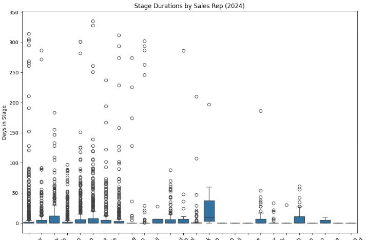
Create visualizations using matplotlib and seaborn to display the distribution of stage durations and stage durations by sales rep.
import subprocess
import sys

try:
    import simple_salesforce
except ImportError:
    subprocess.check_call([sys.executable, "-m", "pip", "install", "simple_salesforce"])
finally:
    from simple_salesforce import Salesforce

import pandas as pd
import matplotlib.pyplot as plt
import datetime
import seaborn as sns

# 1. Salesforce Connection
# Replace placeholders with your actual credentials
sf = Salesforce(
    username='your_username',
    password='your_password',
    security_token='your_security_token'
)
# 2. SOQL Query to Extract Opportunity History (Limited to 2024)
query = """
SELECT
    OpportunityId,
    StageName,
    CreatedDate
FROM OpportunityHistory
WHERE Opportunity.CreatedDate >= 2024-01-01T00:00:00Z
"""
results = sf.query_all(query)
df = pd.DataFrame(results['records']).drop(columns='attributes')

# 3. Data Processing and Stage Duration Calculation
df['CreatedDate'] = pd.to_datetime(df['CreatedDate'])
df = df.sort_values(by=['OpportunityId', 'CreatedDate'])

# Calculate the time spent in each stage
df['StageDuration'] = df.groupby('OpportunityId')['CreatedDate'].diff()

# Define the function to get sales rep
def get_sales_rep(opportunity_id):
    # Query Salesforce to get the OwnerId (Sales Rep) for the given opportunity_id
    query = f"SELECT Owner.Name FROM Opportunity WHERE Id = '{opportunity_id}'"
    result = sf.query_all(query)
    return result['records'][0]['Owner']['Name']

# 4. Data Analysis with Pandas
# Analyze by sales rep
df['SalesRep'] = df['OpportunityId'].map(lambda x: get_sales_rep(x))
stage_by_rep = df.groupby(['SalesRep', 'StageName'])['StageDuration'].mean()

# Aggregate stage durations
stage_agg = df.groupby('StageName')['StageDuration'].agg(['mean', 'median', 'std'])

# 5. Data Visualization
# Histogram of stage durations
plt.figure(figsize=(10, 6))
sns.histplot(df['StageDuration'].dt.days, bins=30, kde=True)
plt.title('Distribution of Stage Durations (2024)')
plt.xlabel('Days in Stage')
plt.ylabel('Frequency')
plt.show()

# Box plot of stage durations by sales rep
plt.figure(figsize=(12, 8))
sns.boxplot(x='SalesRep', y=df['StageDuration'].dt.days, data=df)
plt.title('Stage Durations by Sales Rep (2024)')
plt.xlabel('Sales Rep')
plt.ylabel('Days in Stage')
plt.xticks(rotation=45)
plt.show()
I’ve intentionally snipped the names from the X-axis, but you can see this graph is studying the # of days the Opp was open before closing.
Notice how the 4th Sales Rep from the left has their entire cluster of opps from 10 to 100 days, with absolutely ZERO opps living longer than 100 days?
That is close adherence to the rules — that is a clean pipe made by an experienced rep, we love to see this! What we DON’T want to see is wide variance — aka Rep Number 6 (6th from the left) — they have deals that go from 10 days to close to…. 340 days.
Not just one outlier either: there are a few deals at that ripe old age. Then another cluster in the high 200s. This rep isn’t running as clean a process.
As a Revenue Strategy and Operations leader, I'm constantly digging into data to uncover insights and drive better decisions. Pandas is my go-to tool for this. It's a Python library that provides incredibly powerful and flexible data structures, especially the DataFrame.
What I love about Pandas is how it simplifies complex tasks. Whether I'm cleaning messy data, transforming it into a usable format, or conducting in-depth analysis, Pandas has the functionality I need. It's like having a Swiss Army knife for data manipulation! I can easily filter, sort, aggregate, and perform calculations on my data, all within a clean and intuitive framework. Pandas also integrates seamlessly with other libraries like Matplotlib and Seaborn, enabling me to create compelling visualizations that communicate my findings effectively.
In essence, Pandas empowers me to turn raw data into actionable intelligence. It's an indispensable part of my toolkit for optimizing revenue strategies and driving operational efficiency.


